Money transfer website conversion redesign
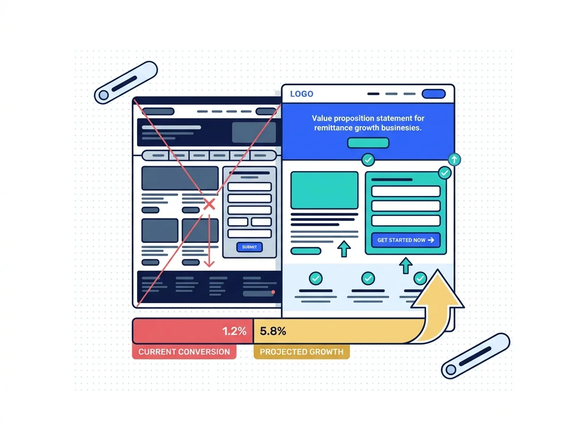
The rate calculator sits below the brand statements, and the corridor page never mentions cash pickup. Redesign starts with the decision a sender is making, not with the palette.
Remittance only · Decisions before design · Measured before and after it

Website conversion redesign for remittance companies rebuilds the pages a sender actually decides on: the homepage, the corridor pages, the rate calculator and the registration form itself. Every change is argued from the decision the sender is making, and the same six measures are compared before and after, so the result is a conversion number rather than a nicer looking website.
What changes on the site
Most remittance sites are designed for the brand team and tested on nobody at all. Four things change.
Rate three clicks in
The sender has to hunt for the rate that brought them in.
Rate on first screen
The calculator sits at the top with the corridor preselected.
Trust below the fold
The regulator details sit in the footer with the sitemap.
Trust where it counts
Security, support and the fee shown beside the send button.
Forms built for us
A dozen fields get collected before anybody sees a rate.
Forms built for them
Only the fields needed to show a quote, and nothing else.
Launched, then guessed
Nobody knows whether the new site actually converts any better.
Launched, then compared
The same six measures, taken before the change and after it.
What the redesign covers
Four rows of work, run in order. The audit decides which pages actually get touched at all.
What this redesign service actually is
The branding is not really the point at all. Redesign a remittance website around customer decisions, trust, acquisition and transaction progression rather than changing visual branding for its own sake.
- Existing conversion audit first
- Analytics reviewed by device too
- Drop-off found before any design

The single rule behind all of it
Nearly every argument in a redesign comes back to this one sentence. The website should be rebuilt around the customer's decision, not simply around the company's preferred visual identity.
- Decisions mapped before layouts
- Trust signals placed on purpose
- Copy written against the objection
What a sender needs before deciding
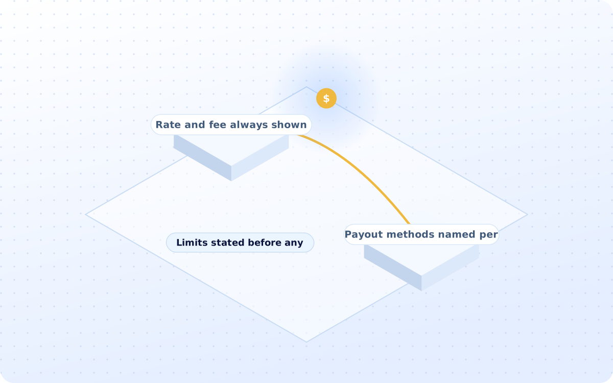
Determine which information customers need before acting. Rate, fee, speed, recipient method, security, supported country and transfer limits all belong above the fold on a corridor page, not three clicks in.
- Rate and fee always shown together
- Payout methods named per country
- Limits stated before any signup
Proving that the thing moved at all
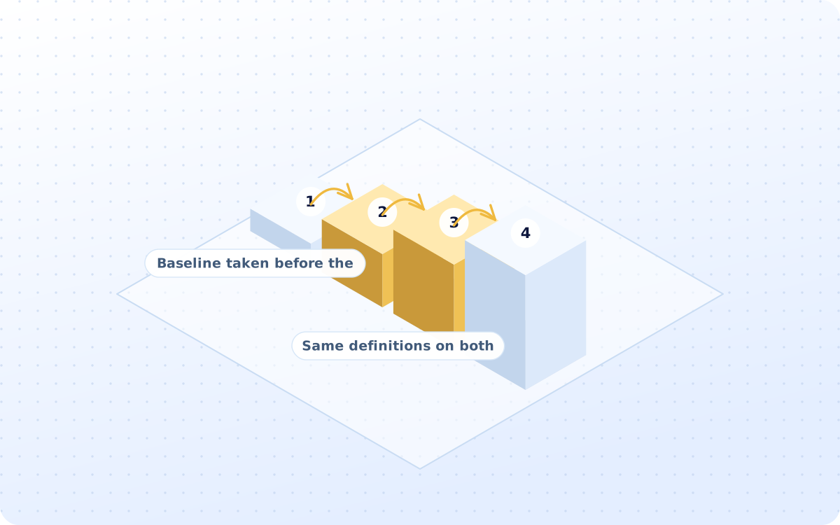
Baseline conversion, new conversion, registration, KYC completion, first transfer and revenue contribution are compared on the same definitions, before and after, so the redesign can be judged rather than admired.
- Baseline taken before the work
- Same definitions on both sides
- First transfers counted, not clicks
What you actually receive
Six artefacts, all of them yours to keep. The decision map is the one worth arguing over.
Conversion audit
Where the website loses people, page after page, with the size of every single loss measured.

The decision map
What a sender has to know before acting, and precisely where each of those answers now sits.
Page wireframes
The homepage, the corridor page, the landing page and the form, drawn at mobile width first.
Copy and CTA set
Every headline, every button and every objection answer, written for the corridor it sits on.
Prototype for testing
A clickable version, put in front of real senders before anything at all gets built for real.
Before and after report
The same six measures, all taken twice, with the difference stated in first transfers alone.
How the whole redesign runs
Four stages, run in order. Nothing at all gets drawn before the decision map has been agreed.
Where the site is actually losing people
Homepage, corridor pages, forms and signup are reviewed against the analytics, and the exit pages usually name the problem before anybody argues.
- 01Homepage and corridor pages read
- 02Analytics checked by each device
- 03Exit and drop-off pages listed
- 04Real senders watched actually using it
- 05Baseline recorded before changes
What genuinely has to be on the page
The rate, fee, delivery speed and the payout method are ranked in the order a sender needs them, alongside clear objection-handling copy.
- 01Decision factors put into order
- 02Trust signals given a position
- 03Objections answered on the page
- 04Headlines rewritten for senders
- 05CTA text says what happens next
The four pages that actually do matter
The homepage, the corridor page, the landing page and the registration form are redrawn at mobile width first, then tested before build.
- 01Homepage rebuilt around the rate
- 02Corridor pages get payout detail
- 03Landing pages made to match the ad
- 04Forms cut back to what is needed
- 05Navigation says send money first
Whether any of it has actually worked
The same six measurements are taken again after launch, because a page that lifts registrations but not first transfers has achieved nothing.
- 01The registration rate compared
- 02KYC completion compared as well
- 03First transfers counted properly
- 04Revenue contribution is reported
- 05Any losing changes reverted fast
What the work actually does
Fifteen groups of work sit behind the service, and these twelve are what actually changes on site.
Analytics review
Traffic, exits and device splits
Decision mapping
What a sender needs to know first
Homepage redesign
Rate calculator above everything
Corridor pages
Payout methods and delivery times
Landing pages
Built to match the ad promise
Form redesign
Fewer fields and a sooner quote
Navigation work
Send money, rates, countries, help
Trust placement
Security and support where it counts
Mobile redesign
Thumb reach and a shorter form
Prototype testing
Watched before anything is built
Before and after
Six measures, taken twice over
Three ways to buy this
One of these will fit, whether it is the whole site or just one corridor page inside it.
Complete site redesign
The audit, the decisions, the wireframes and the measurement, all run once across the site.
- Fixed fee, agreed before we start
- Decision map before wireframes
- Measured against your baseline
Corridor page redesign
One page, audited, redrawn, tested and measured, with the page template handed over to you afterwards.
- One fixed fee, four weeks total
- Usually the corridor page first
- The template gets reused on the rest
Complete conversion audit
Where the site leaks, all ranked, with each fix priced against what it would recover for you.
- Two weeks, priced before we start
- No obligation to redesign at all
- Every leak is costed and ranked
Comparison. A general agency will redesign the site. Website conversion redesign for remittance companies argues every screen from the decision a sender is trying to make.
Position. This service differs from a complete technology rebuild. Most need the corridor page fixed, not the CMS.
- Licensing and AML questions go to a qualified adviser. We handle advertising and marketing compliance.
Audit line. If none of the three fits, a fixed-fee growth audit will say which one should.
Four steps to the change
Two weeks of audit, and then the redesign. Conversion numbers usually settle within about a month or so.
Audit the site
WEEK 1-2Pages, analytics and real senders, read together before any opinion gets aired at all.
Map the decision
WEEK 3What a sender has to know, in order, and where each answer now belongs on the page.
Draw and prototype
WEEK 4-6Wireframes at mobile width, then a clickable version put in front of real senders first.
Ship and compare
WEEK 7-10The new pages go live, and the same six measures get taken again a month afterwards.
How results get reported
No client figure appears without written permission. These three are facts about how the work is run.
Services that pair with this
A redesign is only one move. These three cover the testing and the traffic that surrounds it.
The continuous testing work that keeps improving the same pages after the redesign has shipped.
Learn moreApp Conversion RedesignThe same work inside the app itself, where the KYC screens do most of the funnel damage instead.
Learn moreApp Install & User AcquisitionThe paid traffic that gets cheaper the moment the landing page starts converting any better.
Learn moreQuestions operators ask first
Answers come first. Where the honest answer is no, it says no and explains what to do instead.
Both. An app-led operator gets a download path worth following, and an agent-led one gets corridor pages that name the branch and the pickup options.
Yes. The baseline is taken from your own analytics, using your existing event definitions, so nothing has to be rebuilt before the audit can start.
Yes. Corridor pages are where most of the gain sits, because payout method, delivery time and fee differ per route and generic copy hides all three.
Yes. Website conversion redesign for remittance companies is all that gets done, so the rate calculator and the KYC step are not new problems.
Rate, fee and security wording goes to your compliance review before it ships. Licensing and AML questions go to a qualified adviser.
Analytics access, the corridor list, your current conversion numbers, and whoever signs off the customer-facing wording on rates and fees.
Two weeks to audit, then four to eight weeks to redesign and ship, depending on how many pages move. Numbers settle in about a month.
Yes. The measures run through to KYC completion and first transfer, because a page that lifts signups and nothing else has not earned its cost.
Yes. One page template carries every corridor, with the payout methods, limits and delivery times filled in per route rather than written once.
Partly. A faster login and a saved beneficiary help the returning sender, though repeat sending is moved far more by lifecycle messaging.
Baseline conversion, registration, KYC completion and first transfer are compared on identical definitions before and after, so the gain is a transfer count.
Monthly: conversion rate, registrations, KYC completion, first transfers and revenue contribution, each shown against the same period before the redesign.
By putting the rate, the fee and the payout method where the sender looks first, and by cutting the form down to what a quote actually needs.
First transfers gained against the fee. Website conversion redesign for remittance companies also makes every paid click cheaper, which compounds monthly.
Modestly. A sender who understood the fee first time complains less and returns more often, though the app does most of the repeat work.
Operators, remittance apps and payout platforms on the roster
Marks appear once written permission is on file for each operator.
Audit it before anybody redraws
A redesign without a baseline cannot be judged, only admired. A fixed-fee growth audit will measure the six numbers first, so the change proves itself.
You keep the audit and the decision map whether or not we redesign.